Claude Design Review: 4 Real Cases & The Token Trap Nobody Mentioned
Practical Guide for Claude Design
Brilliant cut prompts from 20+ to 2. Datadog killed week-long design cycles. But there’s a catch most reviewers missed.
Hey! Today we’re going deep on Claude Design. The tool that made Figma’s stock drop 7% in a single day and made every product designer on X simultaneously panic and tweet about it.
Anthropic shipped Claude Design on April 17, alongside the Opus 4.7 release we covered last week. The timing was loud. Mike Krieger (Anthropic’s Chief Product Officer and the guy who literally co-founded Instagram) quietly resigned from Figma’s board three days before the announcement. The Information had already reported that Anthropic’s next model would ship with design tools. The market read the signals and Figma got punished.
Then I actually used Claude Design for a week. And the headline takes are wrong.
It’s not a Figma killer. It’s not a Lovable competitor. It’s something neither category covers, and that’s exactly why it matters.
At a Glance
In this piece, you will learn:
- What Claude Design actually does (and what it doesn’t), with real screenshots
- 4 production case studies from Brilliant, Datadog, Mercury, and Peter Yang’s 16-minute everything-build
- 5 power-user tips that separate “shipping” from “burning your weekly quota in 30 minutes”
- The honest catch on token economics that nobody on Twitter is talking about
Keep your mailbox updated with practical knowledge & key news from the AI industry!
What Claude Design Actually Is
Claude Design is a conversational prototyping tool. It lives inside claude.ai (look for the Design tab in the sidebar after you log in), and it’s powered by Claude Opus 4.7, the most capable vision model Anthropic has shipped to date.
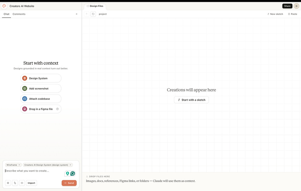
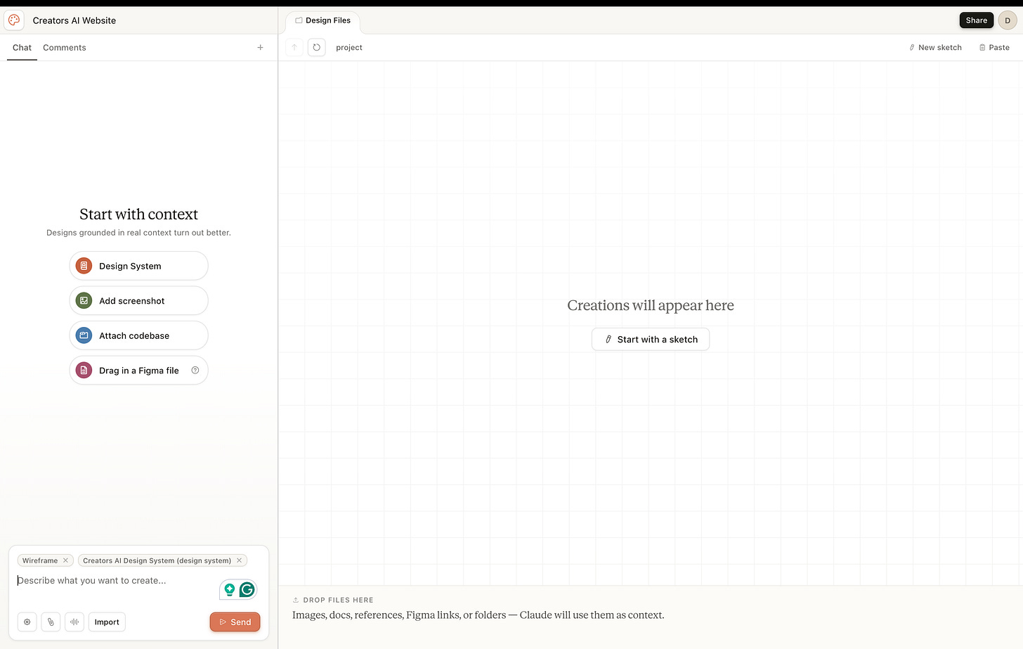
The interface is dead simple: chat on the left, canvas on the right. You describe what you want in plain English. Claude builds a working design on the canvas. You refine through conversation, draw red marker annotations directly on the design, click and tweak elements, or drag custom sliders Claude builds for you on the fly.
Here’s the part that made my jaw drop: it’s not generating images. It’s generating live HTML, CSS, and React components. Real code. Things you can click. Things you can hand to a developer and say “build this.”
That’s not an image generator. That’s an actual design tool.
The output covers most of what teams ship every week:
- Landing pages and marketing sites
- Clickable interactive prototypes
- Pitch decks and presentations
- One-pagers and SOPs
- Wireframes and design explorations
- Brand systems and component libraries
- Even animated brand videos and 3D web experiences
It exports to PDF, PPTX, Canva, standalone HTML, Keynote, and Figma import. There’s also a killer feature most people miss: it packages everything into a handoff bundle for Claude Code.
The 5 Features That Actually Matter
Most of the launch coverage stopped at “AI tool that makes designs.” That’s too shallow to be useful. Here’s what actually changes the game:
1. Design system ingestion. Point Claude at your codebase or design files during onboarding. It reads your colors, typography, components, and spacing rules, then applies them automatically to every project after that. Teams can maintain multiple design systems for sub-brands or campaigns. The single source of truth becomes your code, not a Figma library that drifts over time.
2. Web capture tool. Drop in a URL and Claude pulls elements directly from your live site so prototypes look like the real product. This is huge for marketing teams iterating on existing pages.
3. The Tweaks panel. Custom sliders that Claude builds for you on the fly: typography scale, color temperature, spacing density, section ordering. Drag the sliders, the design updates live. And here’s the part nobody mentions: the Tweaks panel doesn’t burn chat tokens. More on that later.
4. Inline comments. Click directly on any element and request a targeted change instead of describing the location in chat. Faster, cheaper, more precise.
5. Handoff to Claude Code. When you press “Hand off to Claude Code,” it doesn’t just dump HTML. It packages the design with the intent, component choices, and architectural decisions preserved as context. Claude Code then builds on top of the design instead of reinterpreting it.
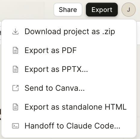
Claude Design export menu showing Canva, PDF, PPTX, HTML, and the killer Handoff to Claude Code option
That last one is the difference between Claude Design and every other AI design tool that’s launched in the past year. We show below how we used it in our case
Real Case 1: How We Rebuilt Creators AI in Claude Design
Starting with our own case because this post you’re reading is the proof. We rebuilt the Creators AI brand and website from scratch in Claude Design over a single weekend. Including the thumbnail you saw at the top of this post. Here’s the exact workflow that worked.
Step 1: Feed it the existing site. Pointed Claude Design at thecreatorsai.com using the web capture tool. It pulled our colors, fonts, voice, and component patterns directly from the live site. No design tokens uploaded. No Figma file. Just the URL.
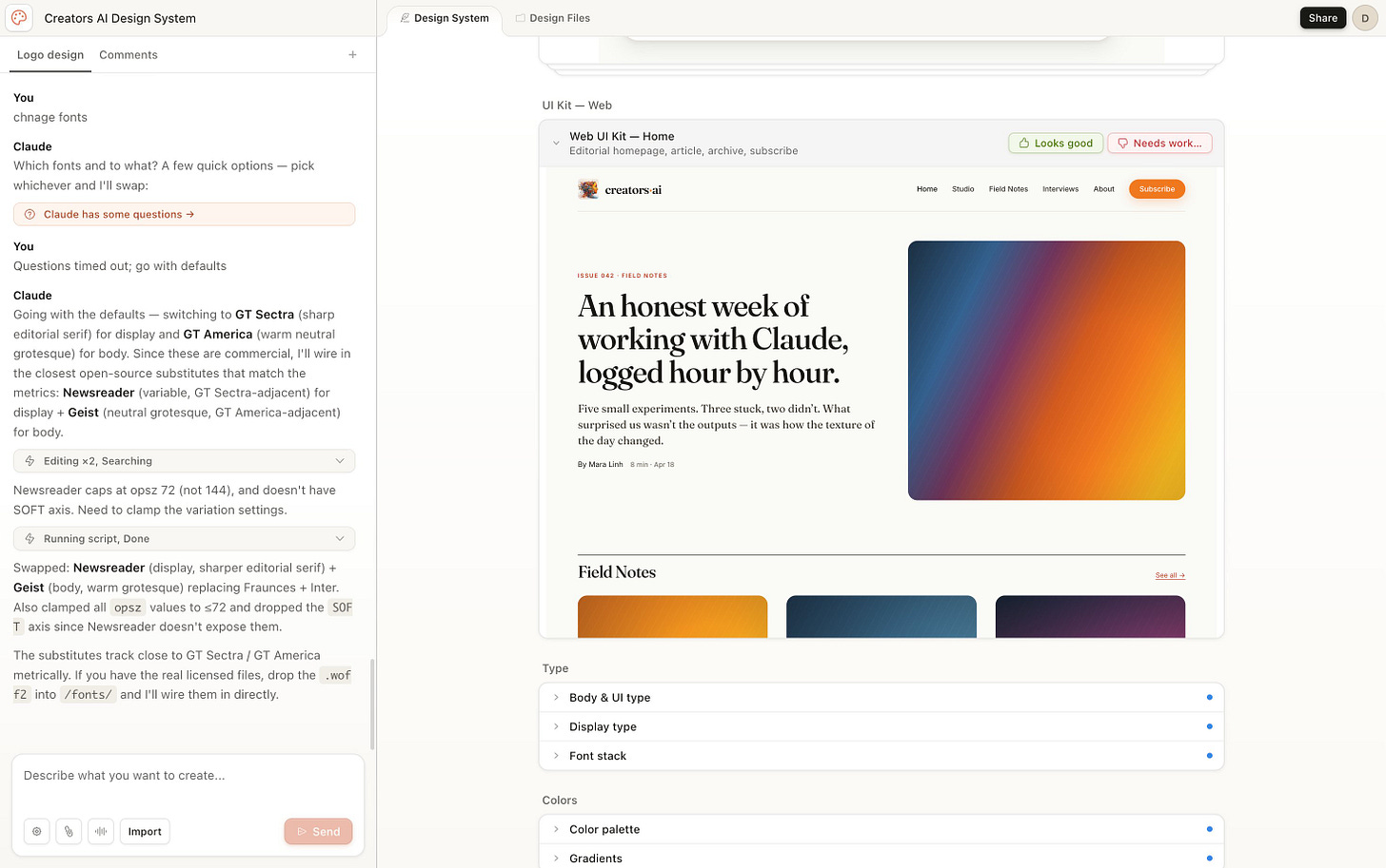
Step 2: Let Claude generate a design system. It produced a draft Creators AI Design System with palette, type scale, components, and layout patterns. We loved it from the first shot.
Step 3: Add the media kit and ask for the full design. Once the design system was living Claude Design, we fed it our media kit (audience, positioning, social proof, mission) and our existing site content, then asked it to generate the new homepage hero. Wireframes first, then the visual design specs.
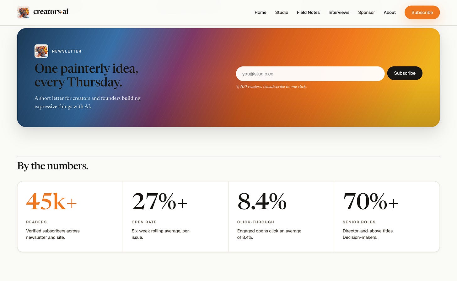
Step 4: Export to Claude Code. Once your design is validated, you don’t need to keep iterating in Claude Design. You hand it off to Claude Code for production. Thats what we did, stay tuned for updates about our new website!
Why this case matters for you: The pattern is portable. Use Claude Design for the system creation and visual exploration where the visual interface and Tweaks panel earn their keep. Then export to Claude Code for the production build. Don’t try to ship the whole site in Claude Design. Use Design as the visual brain. Use Code as the production engine.
Oh, and the post thumbnail at the top of this article? Also generated in Claude Design. Same design system, one prompt, ready to drop into Substack.
Real Case 2: Codifly Built a Two-Screen Mobile App in One Conversation
The team at Codifly Software (their full step-by-step is here) documented every screen of building a complete golf course booking app in Claude Design. Two production-ready iOS screens, real interactions, branded theme, all from a single chat.
The prompt that started it:
I am making a golf course booking tool mobile app and I will need mobile app screens for it. I just need 2 screens for it: 1. Dashboard screen, 2. Booking screen with slot selection. I want to give you color palettes for it.The dark theme felt too heavy for a golf product, so they typed one follow-up: “I think it’s too dark for the golf course booking tool, let’s make it a bit green and light shade.”
Claude understood the intent immediately and shifted to a warm off-white shell with green accent primaries, kept the dark green hero card for brand impact, and even fixed a CSS bug it caught during the iteration.
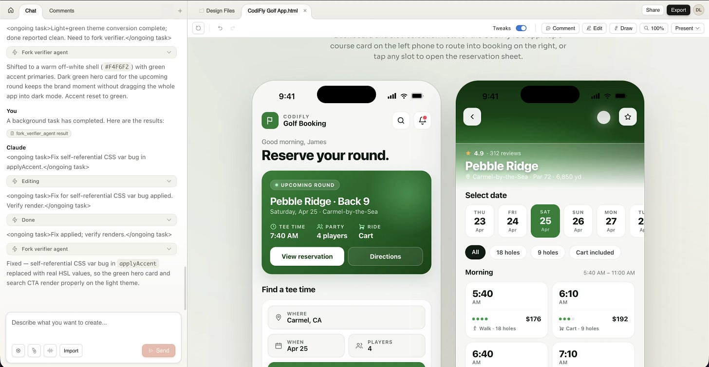
Same app, one iteration later. Light + green theme, full retention of the interactive prototype, ready to share with developers or convert to Figma. Source: Codifly Software guide.
Why this case matters: Codifly is a working dev agency, not a launch-day testimonial. Their team showed every step of an actual client-style build, with the prompts and screenshots to back it up. Two screens, two prompts, light and dark variants. The kind of work that traditionally costs $3K-$5K in Figma + design review billed time, done in 20 minutes.
Real Case 3: Claudia + AI Built an Enterprise Design System From a Public GitHub Repo
Claudia (an enterprise AI program lead who writes Claudia + AI) documented this end-to-end using Decathlon’s open-source Vitamin Web component library as the input source.
The workflow:
- Pointed Claude Design at the public Vitamin Web GitHub repo
- Claude analyzed the codebase for ~5 minutes, extracting components, colors, typography, spacing rules
- Reviewed the auto-generated design system in chat, adjusting colors that didn’t fit
- Validated by running test prompts against it
- Published it so every new project in the org would inherit it
The validation step is what makes this enterprise-grade. Claudia ran a generic test prompt against the published system:
Design a settings page for an admin tool with sections for users, integrations, billing, and security, in a clean enterprise SaaS aesthetic.The output came back already on-brand: the right colors, the right typography, the right component patterns, no extra prompting required.
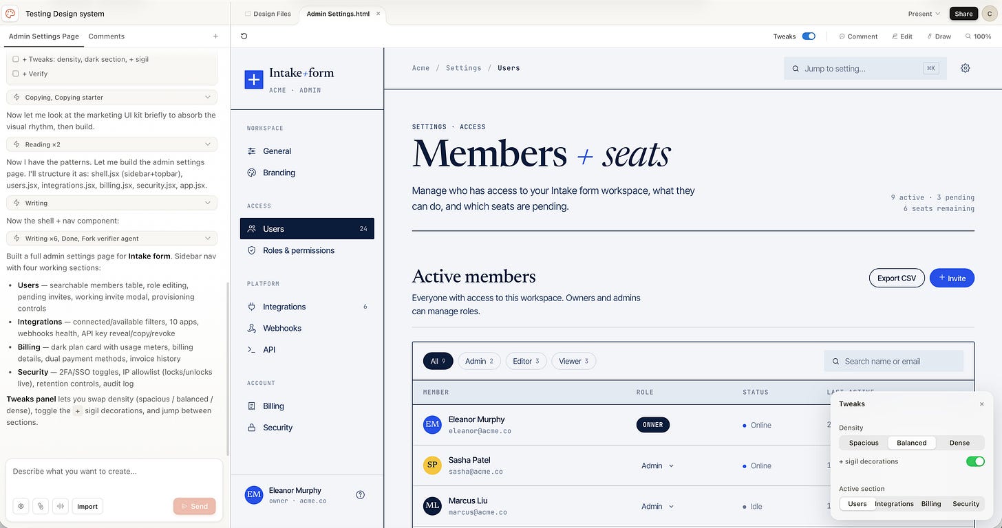
Generic prompt, branded output. The settings page Claude Design generated using the validated design system. No brand assets re-uploaded, no manual color picking. The system handled it. Source: Claudia + AI starter guide.
For agencies, that means setup once per client and ship branded prototypes for years. For product teams, it means design consistency without policing. For solo founders, it means your generated work stops looking like every other AI-generated landing page on the internet.
If you’re already working through this kind of design+dev pipeline and want to see how others are packaging it as services, our 4 Ways to Monetize AI Agents in 2026 post breaks down exactly how creators are turning workflows into retainers.
Real Case 4: Peter Yang’s 16-Minute Everything Build
Peter Yang (Creator Economy newsletter) ran one of the most-shared experiments of launch week: build five completely different things in Claude Design and see what holds up.
In 16 minutes, he generated:
- An animated brand video (no manual editing, just a prompt)
- A pitch deck for a fictional startup
- A landing page that looked production-ready
- A mobile app prototype with working interactions
- The initial design system to tie them all together
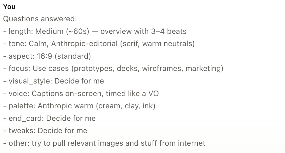
Claude Design asking clarifying questions (length, tone, aspect ratio) before generating Peter Yang’s animated video. Same behavior as Claude Code. Source: Behind the Craft by Peter Yang.
The animated video alone would have taken hours or days in After Effects. Claude built it as actual code, so Peter could manually tweak the color palette and toggle captions on or off without re-rendering anything.
The catch he flagged: the video can’t currently export as MP4. He had to use Mac’s screen recording to save it. That’s the kind of “research preview” rough edge worth knowing before you bet a client deliverable on it.
But the experiment proved something real: the same conversation can produce a landing page, the pitch deck, the clickable prototype, and the social campaign, all on-brand and ready to ship. That’s not five tools stitched together. That’s one tool replacing five. But there are some nuances…read below
5 Power-User Tips From a Week of Real Use
Most people use Claude Design like a chatbot. Type, regenerate, type, regenerate. Then they wonder where their weekly allowance went.
Here’s what veterans like Anthropic’s own Austin Lau, Sid Saladi, and the early reviewer community have figured out:
1. Tweaks panel for everything that isn’t conceptual. If you can move a slider to fix it, never type it. Sliders for typography, color temperature, spacing, and section ordering live in a side panel that adjusts the design without round-tripping through the model. Reorder hero sections, swap variant cards, tighten density. None of it costs you a chat turn.
Rule: Use chat for structural and conceptual changes (“add a testimonial section,” “make it feel editorial instead of corporate”). Use Tweaks for everything else.
2. Edit your previous message instead of sending a new one. Same trick that works in regular Claude chat works here. Going back and editing a prompt replaces the old exchange instead of stacking it. Massive token savings on long iteration sessions.
3. Set up your design system on day one. Most people will skip this. Don’t. Fifteen minutes of design system setup equals 10x better output for the next six months. Upload your codebase, design files, logos, fonts. Every project after that uses your brand automatically.
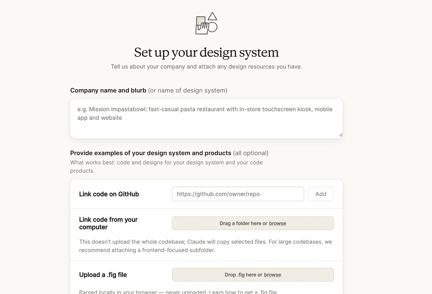
Claude Design’s organization-level design system management interface showing brand assets, color palettes, and component libraries
4. Be specific in feedback. “This doesn’t look right” is impossible to act on. “Tighten the spacing between form fields to 8px” gives Claude exactly what it needs and burns roughly half the tokens of a back-and-forth clarification loop.
5. The comment-paste workaround. Inline comments occasionally disappear before Claude reads them (a known issue in the research preview). If your comments aren’t being picked up, paste the feedback directly into chat instead. Both Anthropic’s official docs and every reviewer flagged this.
Prompts You Can Steal
Three prompts that consistently produce ship-quality output. Adapt to your case.
Prompt 1: The Landing Page
Build a landing page for [PRODUCT/COMPANY] targeting [AUDIENCE].
Hero section with one clear value prop, three benefit blocks
with icons, one social proof strip with logos, one pricing
section with three tiers, FAQ accordion, and CTA footer.
Tone: [editorial/playful/technical/corporate].
Use our design system for colors, typography, and components.
Make it mobile responsive and include hover states.
Prompt 2: The Pitch Deck
Create a 12-slide investor pitch deck for [STARTUP].
Structure: Title, Problem, Solution, Market Size, Product Demo,
Business Model, Traction, Competition, Team, Financials, Ask,
Closing. Keep one core idea per slide. Include placeholder
metrics I can fill in. Use our brand system. Export-ready as PPTX.
Prompt 3: The Interactive Prototype
Build an interactive prototype for [FEATURE]. Include the
empty state, loading state, success state, and error state.
Add hover and click animations. Make every button functional
so I can click through the entire flow. Use our design system.
Include a Tweaks panel with sliders for animation speed,
density, and color intensity.
The pattern across all three: role + context + structure + constraints + design system reference. We covered the deeper version of this in our context engineering post. The same logic applies here.
The Honest Catch: Token Burn
Here’s the part most reviewers buried, glossed over, or didn’t notice until they got rate-limited mid-session.
Claude Design has its own weekly allowance (separate from your chat and Claude Code limits), and on the Pro plan, it can exhaust faster than anyone expected.
The numbers from launch-week reporting are not pretty:
- Multiple users on r/ClaudeAI reported burning 95% of their weekly Pro allowance in two prompts
- PCWorld’s reviewer burned the full weekly allowance in one sitting
- CopyRocket AI tested it on a real brand and burned 90% of weekly allowance in 4-5 prompts
- Sid Saladi’s analysis pegs concrete costs on Max 5x at roughly $3 per landing page, $4 per video, $7 per deck in token equivalent
A power-user designer field report on the launch put it bluntly: “Rationing creativity goes against the spirit” of what this tool is supposed to enable.
So what’s actually included? Per Anthropic’s official pricing docs: every paid plan gets a recurring weekly Claude Design allowance that resets every seven days. Each user has their own bucket. It’s not pooled. Once you’re out, you can buy extra usage at standard API rates if you’ve enabled it in settings.
The honest read:
- Pro plan ($20/month): Treat it as a trial. Expect to ship one or two real projects per week before you hit limits. Fine for testing the tool. Not fine as your only design surface.
- Max 5x and Max 20x: This is where it becomes a real workspace. Multiply allowances scale roughly with the tier number.
- Team and Enterprise: Off by default for Enterprise. Admins must enable it in organization settings. Per-seat allowances apply.
If you’re going to lean on Claude Design for production work, budget Max 5x at minimum. The Pro plan is for kicking the tires.
When to Use Claude Design vs the Alternatives
Where Claude Design wins, in plain language:
- Conversational starting point: when you don’t have a Figma file yet, just an idea
- Design system enforcement: when brand consistency across many assets matters more than custom artistry
- Code handoff continuity: when you’re shipping the design to engineers (especially if they use Claude Code)
- Speed of exploration: when you need three directions in seven seconds, not three days
Where Figma still wins:
- 50-screen production systems with strict component governance
- Multiplayer collaboration in the same canvas in real time (Claude Design has shareable links but no live multiplayer yet)
- Source of truth for mature, large design teams
Where Lovable, Bolt, v0, and Replit Agent still win:
- Full-stack apps with backends, auth, and databases: Claude Design intentionally doesn’t ship working apps
- Production deployment: Claude Design is a prototype layer, not a deployed product
Where Canva still wins:
- Quick social graphics, Stories, posts: template-driven work
- Non-technical users who just need to resize and export
The fact that Claude Design exports directly to Canva tells you everything. Anthropic is not trying to win the Canva market. They’re trying to own the on-ramp before someone hits Canva.
If you’re building a vibe coding workflow and want to know where Claude Design slots in alongside the rest of the stack, our Vibe Coding Inspo: Hot Cases and Tips post covers the broader landscape.
The Bottom Line
Claude Design isn’t the death of Figma. It isn’t going to replace Lovable for full-stack builds. It isn’t a Canva killer either.
What it actually is: the design layer that finally talks fluently to the build layer. A conversational starting point for people who used to wait on a designer for a week. A way for one person to ship what used to take a team and a sprint.
For founders and PMs who can’t open Figma without breaking out in hives, this is the on-ramp that didn’t exist before. For marketing teams running multi-variant campaigns, this is the production engine that finally matches the speed of paid ads testing. For designers with taste and judgment, this is the tool that finally makes exploration cheap. The part of the job that matters (the strategic choices) can finally scale.
And for everyone, it’s a reminder that the medium of design is changing. The static screen approach (mapping every page in advance) is over. The prototype is becoming the product. The conversation is becoming the artifact.
The token economics are a real friction point right now. Plan accordingly. But the direction of travel is clear, and Claude Design is the cleanest expression of it shipped to date.
Try it at claude.ai/design. Start with the design system setup. Then build something small and ship it before you build something big and burn your weekly quota at 9am Tuesday.
What’s the first thing you’d build with Claude Design? A landing page, a pitch deck, or something weirder? Drop it in the comments. I’d love to know.
If you missed our previous posts on the Claude ecosystem, here they are:
This article was first published in the Creators AI newsletter. View the original edition.